I’ve been on a bit of a Harry Potter bender of late, making everything from wands and snitches to chocolate frog boxes and even a Fawkes puppet. One of the first things I made was a Hogwarts Acceptance letter, a project which I recently decided to revisit for a blog entry. It only took a little research to realised how far short my first attempt had fallen, and how much work was still ahead of me…
Visit my gallery for more Harry Potter items that I've created!
Materials needed:
Computer with a word processing/publishing package
Inkjet printer
2 sheets A4 inkjet friendly, parchment paper
Fimo
Glue gun
Cooking oil
A scrap of flat plastic, like you get in blister packs
Red paint
Paper glue
1. Using the typefaces
The first problem I encountered was that although there are some awesome typefaces out there, there were none that really matched the text on the Acceptance Letter. Being a bit of a stickler I have resolved this issue by creating some myself.
 |
| DearMrPotter |
 |
| 4PrivetDrive |
If you unpack these and drop them in your Fonts folder you should now have access to two beautiful new typefaces that closely mimic the look of the screen used props. Whilst creating these I also discovered a neat trick to do with “ligatures”, a feature that substitutes characters for glyphs when they are placed in a certain order. This feature is open to wonderful abuse, as you will discover if you type the word “mcgonagall” or “Minerva” using DearMrPotter ;)
 |
| Professor McGonagall's Signature, prepared for print just in case |
2. Layout the letter
I laid out the text in InDesign although you could probably manage this in Word at a push. The page size needs to be A5, so if you wanted you could get two letters out of an A4 sheet.
At the top of the page we have the Hogwarts logo. You can either save this JPEG or download a clean TIF >> here <<:
 |
| High resolution logo for print |
Then the following text set in DearMrPotter:
To Mr Harry Potter,
The Cupboard under the Stairs.
4 Privet Drive,
Little Whinging.
Surrey.
Dear Mr. Potter,
We are pleased to inform you that you have been accepted at
Hogwarts School of Witchcraft and Wizardry.
Students shall be required to report to the Chamber of Reception
upon arrival, the dates for which shall be duly advised.
Please ensure that the utmost attention be made to the list of
requirements attached herewith.
We very much look forward to receiving you as part of the new
generation of Hogwarts’ heritage.
Draco Dormiens Nunquam Titillandus
This text beneath professor McGonagall’s name is set in Lumos:
Professor McGonagall
And finally Dumbledore’s name and title at the bottom set in Garamond:
Hogwarts School of Witchcraft and Wizardry
Headmaster: Albus Dumbledore, D.Wiz, X.j.(sorc.), S,of Mag.Q.
Some people recommend coating white paper in various beverages and then baking it in the oven to achieve a parchment look but this can give you problems with the inkjet ink further down the line. I think it’s better to dodge the mess and just use a decent parchment paper. I found it best to set the text in a dark brown as black looked a little too strong but feel free to experiment.
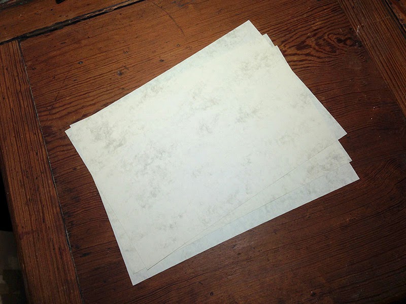 |
| The perfect Harry Potter paper, what a find! |
 |
| The basic layout in InDesign |
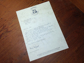 |
| First print of the letter, I actually shifted the text further right in the next draft. |
3. Layout the envelope
This is set in 4PrivetDrive. If you look at the screenshots you will see I have placed the template at a 45 degree angle on an A4 page. This will give us an envelope that fits the A5 letter we have just created. You can download a clean template >> here <<.
Mr. H. Potter,
The Cupboard under the Stairs,
4. Privet Drive,
Little whinging,
SURREY
 |
| The template for the Hogwarts Envelope |
 |
| Spent a lot of time squinting sideways at my monitor setting this. |
4. Cut out the envelope
The envelope template is a very pale grey that should just be visible on the print, but is hopefully light enough that it will be hidden by the creases. Carefully trim along the outside lines, using a penny as a template to neatly round off the corners.
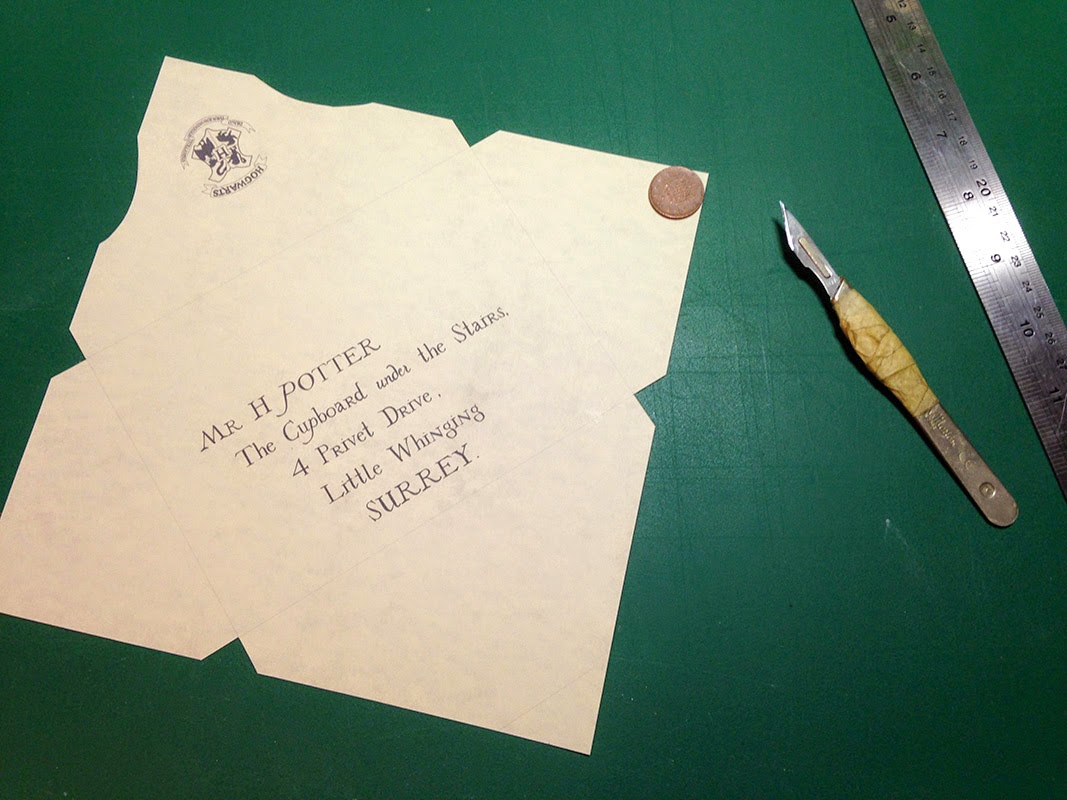 |
| The trimmed letter |
 |
| An awesome scalpel action shot |
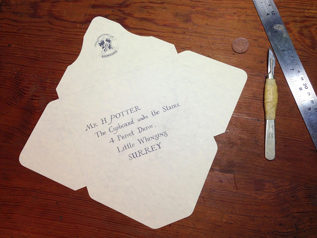 |
| Trimmed and ready to be creased |
5. Crease the envelope
I used a bone creaser to crease the envelope.
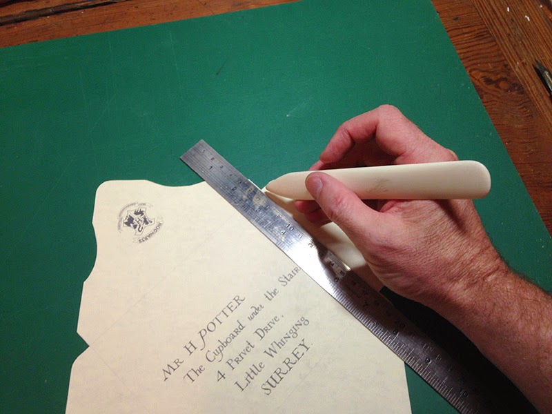 |
If you don't have a bone creaser, the blunt edge of a butter knife will do.
|
6. Make the stamp
Many people making recreations these days opt for the posh new Hogwarts seal sold by Warner Bros., however this was not the seal used in the movie. A simple letter ‘H’ in a shield outline is all that’s required.
 |
| Reference of the seal from the movie prop |
 |
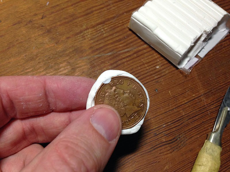
| Blue Peter shot where we gather the materials... |
 |
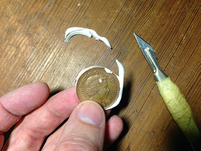 |
I then cut a small template for the Hogwarts shield and traced around it using a pen before carving the design into the Fimo with a scalpel.
 |
| The finished Seal |
When complete this needs to be baked in the oven as per the Fimo instructions, then removed (being super careful not to touch the blisteringly hot coin).
7. Make the impression
You could use real wax for this but it’s not very durable, instead I used hot glue.
Take a flat piece of plastic, like you get in a blister pack, and pool some hot glue in the centre. Take the stamp and coat it in a little cooking oil before pushing it into the hot glue. Leave it to cool slightly before lifting the Fimo out. The oil helps stop the glue from sticking too firmly to the Fimo and eases the release. Without oil my first Fimo stamp only managed two impressions before splitting.
 |
| Don't worry, there is a plastic sheet between the hot glue and my beautiful desk. |
 |
| The glue becomes more opaque as it cools |
8. Paint the impression
A quick lick of red paint finishes the seals and makes for quite a convincing wax effect.
 |
| The slight translucency of the glue and paint adds to the waxy look |
9. Assembly
Now we have to bring all of the elements together: The envelope needs the side flaps to be glued to the bottom centre flap and once dry, the letter needs to be folded in half and placed within. The final step is to attach the seal. With some careful gluing this can be done so the seal overlaps the flap, holding the envelope closed but not requiring removal to open.
 |
| Sealing the deal |
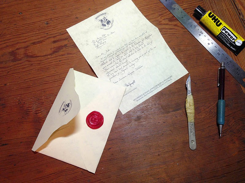 |
| And we're about done! |
10. Finishing
I also printed a second page listing the items new students must bring to school. This page is signed by Lucinda Thomsonicle Pocus, and I expect if you were to type "lucinda" using the DearMrPotter font you might be delightfully rewarded with the signature of yet another Hogwarts Professor ;)
Since we've created this with type rather than templates the acceptance letters are open to all kinds of customisation. You can change the recipient, the address on the front, list of items required… the only limit is your imagination :)
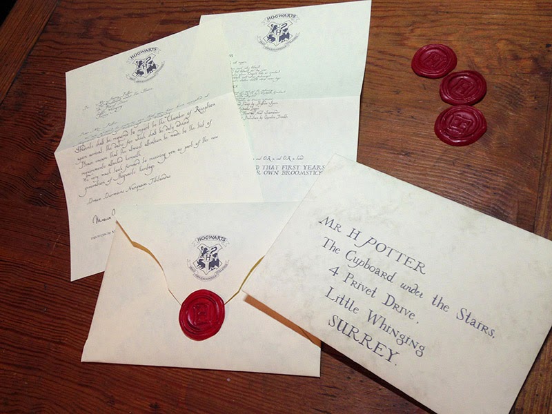 |
| The completed Hogwarts acceptance letter |


Just wanted to say thanks for the fonts and all the detailed instructions!! :)
ReplyDeletecan you post the InDesign template you used for the envelope?
ReplyDeleteI'm afraid I don't have these files immediately to hand but you shouldn't really need them. Just drop the JPEG envelope template into your InDesign document, then place a text box rotated to 45 degrees over the top. Hope your letter making goes well :)
DeleteIs InDesign my only option for using the envelope template? Can I use it in Word somehow?
DeleteWe didn't go full out, but this totally helped us get invitations out for our Halloween party. Thank you!!!!!
ReplyDeleteYou're most welcome. Hope the party goes well :)
DeleteThank you! This is great!
ReplyDeleteNo problemo, glad you liked it :)
DeleteHey, thanks for the instructions. It all looks very authentic. I'm putting a little care package together for a friend and will be using the envelope design for both the acceptance letter and ministry of magic auror office letter. One question though, did you have any trouble fitting the letter into the envelope? The letter I printed out is trimmed from all four sides to be smaller, but my concern is with the template you provided. It almost looks square. Will the printed out envelope have to be trimmed as well on a standard piece of paper? Or if I copy an image of the template and stretch the image to fit the whole document on Word, would that work? Your recommendation?
ReplyDeleteThe template, when printed edge to edge on an A4 page, makes an envelope that fits an A5 letter. The files I have provided are the exact same ones I used in the example, so I know they work. If you're worried I'd suggest making up a scrap one, just to test the fit. I wouldn't recommend stretching the template however as it's on a diagonal. The only way to make a bigger envelope is to print on a sheet of paper larger than A4.
DeleteHope that helps clarify things and that thecare package works out.
Turns out my printer is out of ink so it won't print those light grey lines. As soon as the ink comes in I'll give it a shot. Thanks for the quick response! Do you have a detailed and itemized list list like this for crafting golden snitches as well? I'm kind of on a bender myself and I prefer crafting things rather than just buying them outright. It just has more of a genuine feel to it. Thanks in advance for any additional assistance!
ReplyDeleteHi Hubert,
DeleteI think there are other people out there who've done a better job than me when it comes to snitches. Mine looked good but weren't a huge success.
My first mistake was making them out of pingpong balls... which it turns out are really unfriendly to glue and paint. What I should have done is seal the surface before I applied glue, then seal the whole thing again before I spray painted it... or even better, not use a pingpong ball :P. As it is, the gold paint never dried.
For the detail I sliced some thin plastic tube in half lengthways and used it to form the ridges on the surface. It looks a lot neater than trying to make the pattern out of hot glue, and if you get something wrong it's easy to put right.
I never completed the wings. Spent hours carefully trimming them out of plasticard but hadn't planned ahead and couldn't find a neat way of attaching them to the snitch.
I ended up with an attractive display, but not enough of a success for me to think it was worth writing instructions.
Thank you so much ..It helped me to do me so much
ReplyDeleteNo problem, you are most welcome :)
DeleteThank you so much ..It helped me to do me so much
ReplyDeleteOMG you are the absolute best! Thank you so much, this helped a ton!
ReplyDeleteNo problemo :)
DeleteJust... thanks! Great resources.
ReplyDeleteHappy to be of assistance Kernel o7
DeleteHi This looks great! I'm actually using this format to ask my girlfriend to her prom! The letter looks amazing but I don't understand where you got the template for the envelope from. Is that something that you did in your document, or did you paste that in or something.
ReplyDeleteIs the template somewhere on this page to download?:P I'm probably just being a massive durp and missing it.....
DeleteHi Logan, the template for the envelope is available to download on this page. It's the first image under stage 3. Good luck with the prom.
DeleteJust save the image? Ok so I was being a total dumbass, I was looking for a hyperlink or something like the fonts. Thanks so much.
DeleteHi! The fonts are great! but i was just curious because when I type in minerva and mcgonagall they don't change font. Just curious if anyone knows why or how to fix this:)
ReplyDeleteHi Emma :)
DeleteWhat software are you using? The typeface relies on a feature called 'ligatures' being enabled to display the signatures. I'd have to check whether your software supports this or has an option to turn it on
i'm using Microsoft word on a MacBook Pro
DeleteI'm sorry, I think I put your reply in the wrong place. In short: try right clicking on your text, select the "advanced" tab and tinker with the ligatures options. Hope that helps.
DeleteOK, Word has supported ligatures since the 2010 version. The Microsoft website says:
ReplyDelete"To enable OpenType ligatures, right-click on some text, select Font, select the Advanced tab, and select Standard Only from the Ligatures combo box. This enables the standard ligatures, like fi and ffi."
Any help?
Thank you very much! One of my best friends is going to England for half a year and, just like all of my friends and me, she's a HP fanatic. I do have one question though... I have done my research, yet I couldn't find a store selling parchment paper:( Could you tell me where you got yours? Perhaps they ship to Austria...
ReplyDeleteHi Aline. I bought the paper from a craft store in the UK called Hobbycraft but I have no idea if they ship internationally. You could always take a look on Amazon, there are quite a few options on there. Just make sure it is Inkjet compatible. Hope your friend enjoys her time in the UK.
DeleteHi, I'm having trouble with the layout of the envelope. I have InDesign (but am largely unfamiliar with it) - if I drag and drop the image from your site, I get only the link; if I place it, it's enormous. I tried scaling it to what you have shown but your ruler appears to be different than mine. I did read through the comments (this one, "The template, when printed edge to edge on an A4 page, makes an envelope that fits an A5 letter" seemed most helpful) but in your provided screenshot it doesn't appear to take up the entire page so I'm just at a loss of how exactly to scale it. If you have any tips, that would be awesome.
ReplyDeleteHi Shanna,
DeleteIn InDesign, set up a document to A4 in size. Portrait/ landscape, doesn’t matter.
You can’t (or perhaps shouldn’t) drag an image straight from a browser into InDesign so save the template somewhere you can find it, then drag the image into your active document.
You will need to scale the template image so it fits with the edges of the template sitting right on the edges of the page (use the black arrow to drag a corner of the box whilst holding down CTRL + SHIFT on PC, or CMD+SHIFT on mac). The template is square, an A4 sheet is not so there will be an area of the sheet that is not used.
IMPORTANT: do not delete or move the template image from where you saved it on your computer until you have completed the print. Images are linked, not stored in the document.
After that you’ll need to set up a text box over the top of the template and rotate it to 45 degrees.
Good luck.
My main problem I guess is I can't tell how wide it should be? I have it set up in landscape mode, image is scaled so it hits the top and bottom of the template, but not sure exactly how to scale it width-wise. Does it matter as long as it's square?
DeleteThis is what I have right now: http://postimg.org/image/gpyf004vl/
Yep, that's it. Holding the shift key as you scale it should ensure it remains correct. Just needs to be square.
DeleteAwesome, thank you so much, both for the template and the assistance :D
DeleteHi Robin! This is the best tutorial that I have found so far and the most authentic! Thanks for your amazing fonts. I'm wondering what the font is though for the word "under" on the envelope? It doesn't appear to be 4PrivetDrive. Also, did you vary the font size on the envelope? It looks like it to me, but that may also be just all caps and lowercase. If you did vary the font sizes, do you mind recalling what those were? Thanks so much.
ReplyDeleteThanks Andrea, glad you like the tutorial :)
DeleteThe word 'under' is set in 4PrivetDrive and should appear in the correct style through the magic of ligatures. Most software supports this option, although you may have to Google how to enable it.
I honestly can't remember if I varied the type size, looking at the envelope I don't think I did, but have a tinker and see what you think looks best.
Hope your letter making goes well! :)
This comment has been removed by the author.
ReplyDeleteThis comment has been removed by the author.
ReplyDeleteplease can you make me the envelope one? I really don't know how u make it and I don't even know what did u use for that.. please... I really need it. can u?
ReplyDeleteThis comment has been removed by the author.
ReplyDeleteHi there! I'm having trouble downloading the fonts. I click your link above and it shows a sort of directory but never actually downloads anything. I right click the zip to save as but it just saves the whole webpage as html. Can you help? - Melissa
ReplyDeleteHi Melissa. The links point to files on my google drive. To download them:
Delete1) Click on the link
2) Click on the download button in the top centre of the screen.
Hope that helps.
Thank you! Your work is fantastic!
DeleteHey, I was also having few problems in downloading the fonts. But however, few minutes later i found how to do it. Once you click the link, it will go to a file. At the top right, you will see a downloading option. Click that. It will go to the documents or files app. You click the file named ,"DearMRHarryPotter" or "4 Pivet Drive". After that it will have two files. Click the top one which is NOT 'READ ME'. After clicking that, it will go a page and at the top left you will see a install option. Click that and youve installed it in MICROSOFT WORD.
DeleteP.S - These instructions are if you are doing this in your Destop or Computer.
This is so awesome, thank you so much!
ReplyDeleteMy pleasure :)
DeleteThis comment has been removed by the author.
ReplyDeleteHi! Thanks for this awesome tutorial. I have some trouble with the font DearMrPotter: using Word 2010, regardless of the line spacing letter like the capital M are cut below. Thank you and sorry for my awful english
ReplyDeleteHi Barubo, looks like this may be a problem with my amateur font design skills. Have you tried running a quick print to see if it's just a display problem?
DeleteYes, I have. Unfortunately the letter is cut also in the print. Also I've noticed that other letters, such as f and g, are cut below unless I use way too much line spacing... Thank you
DeleteOK, it appears this is a problem with typefaces that are slightly incorrectly configured, Microsoft Word and Mac/PC compatibility.
DeleteDoes setting the line spacing to “single” help?
Unfortunately no. I've already tried every possible line spacing configuration but nothing helps... do you think using a different software would solve the problem?
DeleteYes, I believe other software will help. I can't fix the typeface as the software I used was a trial version that has long since expired.
DeleteI know InDesign does not suffer from this problem and I've read that PowerPoint doesn't either. I’m afraid I'm really not a Microsoft expert.
Ok, I'm going to try one of those. Thank you very much
DeleteOMG I saw your post! it was awesome! It is the information that i wanted.
ReplyDeleteSorry for my poor English. I'am Korean :D
this July 17th The party of Harry Potter will be held.
I want to make your acceptance letter and I want to give them.
It you don't mind May i use your template?
I hope not to spoil your mood, If i was ill mannered sorry for it
No problem, the resources are here for you to use. Have fun at the party :)
DeleteHi, Thanks for this incredible tutorial! The kids in my class are going to love their acceptance letters! Do you have an example of what is included in the list of items needed (the second page included with the letter)? Thanks again!
ReplyDeleteHi, the full contents of the letter can be found in Harry Potter and the Philosopher's Stone, or by visiting the Harry Potter Wiki here: http://harrypotter.wikia.com/wiki/Hogwarts_acceptance_letter
DeleteHi there, I am so excited to use the DearMrPotter font for my daughter's bithday party invitations. I am having a problem the big swoops under some of the letters are interuppted. Almost like they don't fit. Do you know how to fix this?
ReplyDeleteHi Sherri, this was my first attempt at setting up a typeface from scratch and as a result it has some technical issues. I set my letters in InDesign where everything worked fine, however some people using Microsoft Word have reported the same problem you are talking about.
DeleteI use design software for a living but I have little experience of Microsoft products and have been unable to find a solution to this other than edit the typeface… which is a problem as I used a free trial of the software which has long since expired. I’m told Powerpoint doesn’t suffer from this issue so that’s something you could perhaps try?
Your wording is different from what I've found. Where did you find the wording? I want to get it exact, but I don't have access to the book right now.
ReplyDeleteHi Lindsay, I believe this is accurate to the movie version of letter. The book version is different, as is the version seen in the computer games.
DeleteThis comment has been removed by a blog administrator.
ReplyDeleteAwesome effort! With your talent I'm surprised you only have 6 followers, including myself. I look forward to seeing your future creations. BTW, in your notes about the McGonagall signature, your reference Lumos and Garamond fonts. May I ask where you incorporate them?
ReplyDeleteHi Lisa, Lumos is used just beneath McGonagall's signature, Garamond (or some other serifed typeface) is used to set the text at the foot of the page. Hope that helps.
DeleteHi Sabien,
ReplyDeleteAs the second page never featured in the movie you are free to set this however you think best. I just made it up :)
Yes, thank you. One last thing. How do I access the P for Potter, C for Cupboard and "under" fonts. They do not appear in the character map.
ReplyDeleteHi Lisa, if you have your ligature options enabled they should appear automatically.
Deletethank you for saying this, I just change this and the word "under" show up!
DeleteHello,
ReplyDeleteI just wanted to send my heartfelt thanks and apreciation for this post.
I'm making some custom Hogwarts themed gifts for my Daughter and Nieces this Xmas, and being able to write a letter from Prof. McGonagall is the icing on the cake.
Thank you for taking the time to write up your methodology in construction and composition, as well as making the handwriting font available for others to use!
Kind regards, Tony
Hi Tony, very glad I was able to help. Hope you all have a wonderful Xmas :)
DeleteHi, I am making hogwarts acceptance letters and care packages for my little sisters for christmas this year and was really excited to find your page, but when I click on the links to download either of the type faces the wheel in the display tab turns as if the page is loading but the page itself remains blank and white. Just hoping for any help solving this problem
ReplyDelete(I am using a google chrome browser of that makes any difference)
DeleteHi Caroline, have you tried right clicking on the link and "save as"? The fonts are in zip files.
DeleteHey! First of all: Great instruction, great fonts and great templates.
ReplyDeleteI do have one question though: Your Hogwarts logo and the template have a greyish background. When I print everything on my rather beige parchment-like paper, will the background be printed or does my printer/computer somehow ignore the greyish color?
Regards, Nathalie
Wow, um, that's embarrassing. I output clean JPEGs from Photoshop, I have no idea how that's happened! I'll fix them in the morning.
DeleteOK, I checked the files and uploaded them again... only to discover that once they're integrated into the blog layout they had regained that slight grey shift. I've included links to download clean files in the body text but looks like I can't get images into Blogger without them being adjusted. Oh well. Hope the clean files work for you.
DeleteWow! Thank you very much for your efforts!
DeleteAMAZING! I've been looking for these fonts for hours and none of them match! I considered making my own, seriously, but I wouldn't have had time for that... An enormous THANK YOU!!!!
ReplyDeleteMy pleasure, hope they work well for you :)
DeleteWooaahh! What an amazing job! Congrats Robin and thank you very much for letting other fans have fun with it!
ReplyDeleteI've just have a question, maybe you can help me :D... I've downloaded the fonts and the envelope template, but after looking and looking I'had no idea how to get the layout letter template! Maybe the link is there.. but I don't know.
Theks!
L.
Hi Botón, I didn't put together a template for the letter however you should be able to find everything you require to make your own here on this page :)
DeleteHi,
ReplyDeleteI'm still having trouble getting 'P' right using ligature. I've turned the ligature on but no luck. Any ideas?
Thank you very much for this tutorial, it's fantastic! I'm a bit of a stickler like you and I noticed a little error. It's not "Draco Dormiens Nunquam TiTTilandus" but it's "Draco Dormiens Nunquam Titillandus" (I sound like Hermione ahah) .
ReplyDeletePs: Sorry for my english, I'm italian :)
Thank you, I have updated the text.
DeleteI am unable to get the ligatures to work. Am i right that you just have to type the name in and it turns into the signature? If not, please give me some tips:)
ReplyDeleteYou have to ensure that ligatures are enabled and then type the name. You can copy and paste my text if you want to ensure spelling and capitalisation are correct. If this fails to work then I suggest grabbing the image of the signature I included in the article and dropping that into the document. Does that help at all?
DeleteIt helps a lot, thanks! Just one question, how to I enable the ligatures?
DeleteThat depends on the software you are using. In Word for instance: To enable OpenType ligatures, right-click on some text, select Font, select the Advanced tab, and select Standard Only from the Ligatures combo box.
DeleteThank you very much for your help! I figured it out now;)
DeleteI am having trouble using the Lumos font. I downloaded it, and it shows up in word as "New" in the correct font, but when i click on it, it says "The font 'Lumos Caps' is not available on your system. Do you want to use it anyway?" If I click yes it writes in a different font that is DEFINENTLY not LUmos. Any ideas?
ReplyDeleteThank you so much for this tutorial and especially the fonts. Saved my from having to reinvent the wheel! Cheers!
ReplyDeleteYou're most welcome, Jennifer.
DeleteHi! Your tutorial is fantastic but I cant write "under" like you Can you tell how can do it? Thanks!!
ReplyDeleteThis comment has been removed by a blog administrator.
ReplyDeleteThis was great thanks for the detailed explanation, although I didn't make the stamp, the letter and envelope look great! So thanks for your assistance :)
ReplyDeleteYou are most welcome Lucy, glad the instructions have been of use :)
DeleteI kinda love that you were picky enough to make your own fonts. They're super cool and my letter is going to look phenomenal.
ReplyDeleteGlad you like it :)
DeleteIve been trying to make the envelope because i folded my a4 letter into 4 and it still didnt fit? is there anyway i could make it a tad bit bigger ??
ReplyDelete-lindsay
Hi Lindsay, If you've folded an A4 sheet (210 x 297mm) exactly into quarters it should definitely fit the envelope. The envelope pocket measures 157 x 113mm whilst a quarter sheet A4 is 148.5 x 105mm. Are you certain the envelope template is printed at 100%?
DeleteIf you're still having problems the only way to make things bigger would be to print the envelope on a larger sheet of paper / construct the envelope from multiple pieces. The relationship between the size of the pocket and the the flaps means there's no room to make the pocket bigger using an A4 sheet.
I just came across your tutorial and LOVE IT! My daughter is having a Harry Potter theme birthday party next month and this tutorial has helped greatly with creating the invitations. Being able to download the letter and envelop fonts was a bonus! I, too, am having trouble with the bottom of some letters missing, but I'm not too concerned with it. Thank you very much for putting the time in for us to enjoy. Melissa
DeleteFirst THANK YOU FOR ALL YOUVE DONE INCREDIBLE! CAN YOU PLEASE HELP ME. Im trying to create this fast to mail to family for upcoming trip to HP orlando, I have a 3 yr nephew with Leukemia coming and wanted to have this special for him. I can't seem to figure out how you do the P swayed to look more like the orginal..Ive downloaded fonts and played with them but UNABLE to recreate. Can you please email me..steveandtabitha@yahoo.com THANKS SO MUCH
ReplyDeleteHi, you need to enable the ligatures option. If you let me know what software you are using and what platform you are on (mac or PC) I can try to look into a possible solution.
DeleteThis comment has been removed by the author.
ReplyDeleteHi, Thank you so much for putting this together and making the fonts! They are great!
ReplyDeleteI was wondering if you could help me... I created my letter, but when I print it the DearMrPotter font is cut off. I'm working in Indesign and it shows up fine on the computer. However, when I print 2 pages on 1 it shows up. Unfortunately I need to print one page at a time.
Thoughts? Thanks!
The good news is you're using InDesign so I know a simple fix: Try outlining the type before you print. Just remember to save the original version too in case you want to make any changes.
DeleteI'm trying to use inDesign to print my wedding envelopes using both of these fonts. However, the bottom of my upper case "M" and lowercase "g" and "p" keep getting cut off. Any ideas? I've put spacing between the paragraphs and nothing has worked.
ReplyDeleteHi Lucent, try outlining the type once you have set it. This should sort the problem out.
DeleteHi there...
ReplyDeletethank you so much bro for this wonderful work. I have to make this for my friend who is a potterhead. Can you please send me the clear Image of the letter if possible. It would be a great help.
my mail ID is tanveer785@gmail.com
Also if I am printing this in A4 sheet what is the font size i should keep?
Hi Uzumaki, I’m glad you like the instructions.
DeleteUsing the tools provided here it is possible to make a *very* accurate version of the movie letter but you’ll need to do a little research. Try googling the scene in the movie where Harry opens his letter for accurate reference and to help judge the correct font size.
Hope your friend likes the letter you create, have fun and good luck!
Hi~ I am using this for my wedding invitations and it is awesome. I am using Word and getting grey background behind the words. please help a muggle out! please see the screenshot here: https://drive.google.com/open?id=1tYL86QLXPKtcqZ4TKYboozFboc3VaWXp
ReplyDeleteHi Brian,
DeleteThe font is vector based so contains no shading information. This is a Word issue. A quick google suggests that shading like this can be a text highlight or shading option on your text field (SHIFT+F1 opens a formatting window where some of this can be examined). Unfortunately I am not a Word expert and without being able to get my hands on your computer I can not say for definite what this is. I would suggest googling for a solution, I certainly found a few possible solutions when I looked.
Sorry I can’t be of more help.
have you made the chocolate frog box too?
ReplyDeleteYes, but there are better versions than mine available for free on the internet.
DeleteThank you for sharing all of this! My son is turning 11 this year and I can't wait to see his reaction when he gets an acceptance letter to Hogwarts!
ReplyDeleteCan we use the above fonts in an Educational Environment? Thanks
ReplyDeleteI would like to thank you very much for your generous sharing of information, fonts and others. I'm working on my Gryffindor Common room miniaute and I'm lost in details :( You cannot imagine how your page helped me. Thank you very much again.
ReplyDeleteSincerely,
Defne from Daphne's Handmade
Robin,
ReplyDeleteThank you so very much for the detailed instructions!
We setup our own PDF version that anyone can download and update with their own text. Here's a link to the making of video.
https://www.youtube.com/watch?v=3Qk86GmKPqk
Thank you for your fantastic resource for creating the nearly-perfect HP acceptance letter.
ReplyDeleteHi Robin,
ReplyDeleteshort question (hope you're still reading comments here):
What is the text under the signature that is written in Lumos?
Ah, good spot. That should be "Professor McGonagall" set in Lumos beneath her signature. I've updated the blog to match.
DeleteThanks so much for this! I just made a version of this using a Silhouette Cameo cutter with a pen attachment. The fonts get traced as an outline rather than a single stroke, but it looks sort of magical. If someone were so inclined/skilled they could create a single line version of the fonts, but that ain't me.
ReplyDeleteGiven the 20 year time difference I updated the HeadMistress to McGonagall, and promoted Flitwick to Deputy.
As a final extra touch I also - and this may not even be that noticeable - tried to make the imprint of an owl beak on the top edge of the envelope.
That's nice thinking with the customisation you've applied. Glad you liked the tutorial. Not sure vector fonts could be created as single lines, I'd be interested to see the results if you give it a go.
Deletenice work!!
ReplyDeleteHi Robin!
ReplyDeleteThank you for this excellent tutorial! I have a question: do you still have the original scan of the letter used on the movie? I mean, the one you use as a guide on the left to make the text layout in the program (I want to use it as a guide too). Thank you very much!
Thank you so much for sharing! I especially love the fonts.
ReplyDeleteHi,I have a question. What do you do after you download th efont, becuse its not working for me.
ReplyDeleteyou are a true genius! thanks for taking the time to create these fonts! I'm hoping they will work with an embroidery project I'm working on for my blog.
ReplyDeleteThanks yaaa!!!!
ReplyDeleteThank you so much - my 9 (going on 10 year old) is planning her Harry Potter birthday party and is absolutely delighted to find your 4 Privet Drive font :)
ReplyDeleteThank you SO much!
ReplyDeleteThank you so much! I was just wondering in which font does the second part of the letter go? The list of supplies and stuff =)
ReplyDeleteHi Mary, glad you like the tutorial. We never see the second page on screen so I set it in the same typeface as the letter.
DeleteJust found this tutorial - amazing! Thanks so much for sharing it and the fonts. I can't believe you made your own stamp to make the "wax seal"!!!
ReplyDeleteWhat are the exact measurements of the envelope and the sheets? Thanks!
ReplyDeleteEnvelopes are used for sending letters or documents using regular postal mail. Envelopes are usually made of paper or
ReplyDeletehardened paper. An envelope may be small enough to make you need to fold the paper going into
it, or it can be as large as the paper so that you do not need to fold it
Oh my god. I wanted to make this letter as a suprise for my friend for a long time. I searched a lot of websites but none gave me as much information and help as this one. Thank you very much. This website has almost all te information and help as you could need. It is really helpfull and one doesnt need to go to hundreds of website to get info. ALl the pdfs and almost everything you need is there in his website. I highly recomend this website and the fonts are just what i neede for my letter. The envolope is also amazing because I was searching for it on other websites for a longg time. But this envolope is perfect! My only complain about this website is that the envolope lines or creases where we should fold or cut is really light in colour. I couldnt see where to cut or fold and made mistakes several times. Please darken the cutting lines atleast so that it is easier to cut or fold. Other than this, there werent any problems. Thank you very much once again...
ReplyDeleteI know you posted this years ago but I have to echo the praise! You did a terrific job and I am so grateful to you! Bravo
ReplyDeleteHi Robin,
ReplyDeleteThis is amazing! Wow.
Im currently in the process of making harry potter packs to sell to harry potter fans. I want to include a personalised hogwarts letter in each pack, do you mind if use your stuff to help me build my letters?
Cheers.
That's absolutely fine. Thank you for asking.
DeleteThis is a great tutorial, I Know you have written this years ago, some of your templates work but I am having trouble with your wonderful fonts you have created. Are they no longer good? I Cannot seem to download them, it shows its downloaded on my font book, but when I open a document to type it is not there. Not sure if the Font has an error or if its because I am using a Mac.
ReplyDeleteThanks for your help please let me know.
Hi Naz, I'm sorry the fonts aren't working for you but I'm afraid I can't solve individual computer issues over the internet. I can assure you that the fonts stil work and I use them regularly on my mac. Hope you can resolve the issue.
DeleteThe font files are .otf, they might need to be converted to the font files for mac. I know for windows, I had to convert to .ttf. Google .otf to .ttf converter and it might point you in the right direction.
DeleteHi Robin,
ReplyDeleteI absolutely LOVE your work. Same as above, planning on selling little Harry Potter letters. I know you've given generic permission, but I'd like to ask your personal permission to use your work out of respect - being a fellow creative, I get it can be a bit of a thankless job at times! Would it be ok for me to use your fonts (credited of course) on products sold in my Etsy shop?
Many thanks, Liz.
Yeah, no problem Liz. Appreciate you asking permission.
DeleteThanks from the future for these great fonts.
ReplyDeleteThis comment has been removed by a blog administrator.
ReplyDeleteThis comment has been removed by a blog administrator.
ReplyDeleteThis comment has been removed by a blog administrator.
ReplyDeleteThanks for the help ! My wife is a Harry Potter addict and fiend and our wedding invitation will look like this letter and use this font !
ReplyDeleteHi There!
ReplyDeleteThanks for all the great instructions! Quick Question, what font size did you use for each part? I may have missed it!
YOU ROCK!! Thank you so much!
ReplyDeleteThis comment has been removed by a blog administrator.
ReplyDeleteThis is amazing! Thank you for sharing!
ReplyDeleteLove this! Thank you so much for the thorough tutorial and all the accompanying template. My niece will LOVE this on her 11th birthday.
ReplyDeletei made it and i am only 8 years old i am going to play a prank n my sister with the letter
ReplyDeleteExcellent work, glad you are having fun!
DeleteHow do I fit the emblem on the corner of the envelope because the jpeg is too big?
ReplyDeleteI figured it out
ReplyDeleteThis is amazing!!!! Im building a Harry Potter chest for my coworker and wanted to include a personalized acceptance letter to her son!!! This was perfect and I cannot wait to see her reaction :)
ReplyDeleteThis is great! Thank you ;)
ReplyDeleteI also wanted to add my thanks for helping make my girlfriend's birthday extra special!
ReplyDeleteProf. McGonagalls real signature: https://pasteboard.co/tRnTiEP28CFt.png
ReplyDeleteIt's a transparent png.
This information it’s very helpful and important for me...
ReplyDeletefull body wax near me
This is all so wonderful - thank you so much for creating this site!
ReplyDeleteWonderful! Thanks for setting this site up and sharing detailed instructions. It was super helpful! Here's my 2 cents, the wax seal can be found on Amazon for less than $10 and saves a ton of time: https://www.amazon.com/dp/B09DYBXJR9 :)
ReplyDeleteThis is incredible, very well done! I was wondering if I could ask for your permission to use your font to sell personalised creations? I saw a few previous comments with the same question but thought I would ask myself personally, thank you! :)
ReplyDeleteThat's absolutely fine, thank you for checking in.
DeleteOnly one critique-green ink!
ReplyDeleteHi, thank you so much for your wonderful insrtuctions. I was wondering though if you could share the indesign files please? Thank you
ReplyDeleteThis comment has been removed by the author.
ReplyDeleteThis is exactly what I've been hunting everywhere for! Thank you so much for sharing your time and amazing talent! Is there anyway to use the envelope template in Word or do I have to have InDesign?
ReplyDeleteThank you so much for this resource! When I use the DearHarryPotter font on Microsoft Word, the tails of the low hanging letters eg. g, p, gets cut off. Is there something that I am not doing correctly? Can someone give me some advise on this?
ReplyDeleteI realised (DearMrPotter Font) that the tails appear if I use Adobe Fresco. I don't have access to InDesign, unfortunately, and am trying to find an application that is free. So it may be that certain application are unable to display the low hanging tail? I am not familiar with manipulating custom fonts, and wonder if there is a setting that allows other application to display the low hanging, overlapping tails.
DeleteThank you SO much for the authentic fonts! I'm sure they took ages to create! We are taking the kids to Harry Potter at Universal Studios this summer and they're getting this "letter" for Christmas! :-)
ReplyDelete10+ years after you've created this, know this is the best resource I've come across in my search! I'm planning a birthday party for my almost 9 year old and your page has everything I need. Thanks so much.
ReplyDeleteYou are bloody awesome! This letter (and the tickets to the HP exhibit) was the prize gift this year for my niece.
ReplyDeleteThank you so much for sharing! I´m doing a surprise for my friend, and finding this blog has been a lifesaver; it´s helping a lot! It´s wonderfull
ReplyDeleteprofessional painters in surrey
ReplyDeleteThis is also a very good post which I really enjoyed reading. It is not every day that I have the possibility to see something like this.. pharmaceutical artwork management
ReplyDeleteA really fun and detailed DIY—love how much effort went into matching the fonts and movie-style accuracy. Perfect for any Harry Potter fan who enjoys making props at home. lunchtime 49s results
ReplyDelete