
 |
| One of my experiments... |
I've received delivery of some pretty awesome stuff: I've got my vintage hand-spun, hand-woven canvas...

my Russian pine stretcher bars...

a bag of hand forged nails...

and a box of authentic pigments from L. Cornelissen & Son!

In addition to these I have also acquired some hog bristle brushes, a glass plate for mixing paint and a glass paperweight in place of a muller for grinding pigment.

I'm chuffed to bits with the materials from Cornelissen, this is some seriously quality stuff. The canvas is a little rough but I think it will do the job. The nails are pretty cool but I'm thinking they're far too big for what I've got planned. Not sure what I'm going to do about this as sourcing authentic tacks is proving problematic.
Anyway, whilst I work out these last few details I've been doing some more tests and research:
Ageing Wood
I've been using my time productively and experimenting with techniques to make the wood of the stretcher bars look old. I have an antique pine writing desk in my bedroom and have been using the back of one of the drawers as reference for the effect I'm trying to achieve.
I've mixed up a batch of vinegar and wire wool which certainly appears to work a treat in darkening the wood, particularly when applied over strong tea. The finished effect seems to be very cold however, and the best results I've had involved some mahogany wood stain applied after the vinegar to warm the colour slightly.
 |
| Samples of wood with different concoctions applied |
 |
| A sample of wood sat in the antique drawer I'm using for reference. Fairly convincing? |
A little boot polish can be used to add variation in surface colour to areas which might have been regularly handled. I think older wood might be darker than this but it's a good start.
I've also done some research into the tools used for shaping wood in the 16th Century. It appears hand saws were available so we're well within the bounds of acceptability using one to create the lap joints of the frame.
Mona Lisa
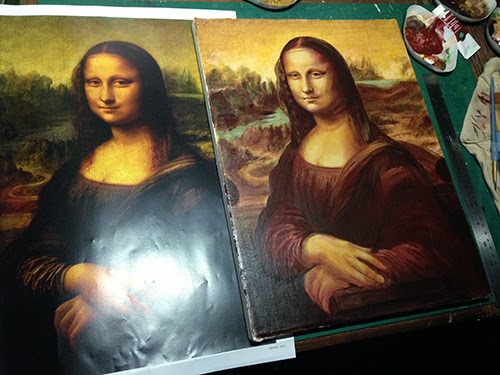
Continuing my research into Renaissance techniques I thought I would have a go at copying the Mona Lisa. I know the real thing is painted in oil on panel, but I needed a classic image to quickly try out a few ideas, like the use of gesso, underpainting, mixing earth colours to make the picture look old and "prick & pounce" techniques.
First I gessoed the surface to smooth it. This took many coats and after half a jar I could still see some canvas texture. Not sure I'm going to be able to get a smooth canvas using oil based primer on the Vigo pic.
 |
| I smoothed the layers of gesso with a squeegee. It's what Leonardo would have done. |
Over the gesso I used a classic "prick & pounce" technique to transfer the image. I took a print of the Mona Lisa and used a pin pricker to trace the outline. I then taped this to my canvas and "pounced" charcoal through the holes. I say "pounced", but in reality I had greater success rubbing charcoal through the stencil with a cloth.
 |
| The "pricked" photocopy |
 |
| The resulting image on the gessoed canvas. |
This worked OK but was a lot of effort. It was days before the feeling returned to my thumb and it took far longer than simply tracing the image would have. The dots were very easy to rub out, and I was careful not to disturb them before I had a chance to mark them more permanently.
At first I tried marking the drawing in with charcoal but the moment a brush touched it, everything washed away. In future I'll mark in the underdrawing with paint or ink to make it permanent.
 |
| The beginnings of my acrylic underpainting |
I was going to put the underpainting in using a monochrome grisaille technique as an experiment but once I'd started painting this went out the window. I'll have to try this another time.


As a brief aside: I found it a lot harder to get smooth gradations of colour using acrylic over a gesso base. Since acrylic dries quickly it can be hard to blend, but the texture of un-gessoed canvas can be used advantageously to help give a half tone that makes colour transitions appear smooth. Without this texture the edges of a glaze can be quite marked. Slower drying oils might not have this problem as there will be far more time to blend and smooth them out.

Craquelure
I've been doing some more tests creating craquelure, trying to work out how flexible the process is. This isn't something I'm planning to use on Vigo, I have an alternate plan for him that will hopefully give somewhat more authentic results, but it's interesting refining techniques I can use on less technical pieces.
I bought some mini canvases and quickly slapped on some light and dark paint as a base for my experiments. These samples show the DecoArt crackle glaze on various support layers and what happens when you dilute it... I also tried painting a water soluble layer in a crackle pattern under the acrylic to see if I could control crackle patterns but that was a bust.
 |
| Thick acrylic gesso undercoat, acrylic paint and thick crackle glaze. The cracks run right through to the white gesso. |
 |
| Acrylic paint and water thinned crackle glaze - no cracks. |
 |
| Acrylic paint and thick crackle glaze, no gesso. Boot polish rubbed into cracks. |
The main problem I've found with the DecoArt is that it cracks too much! The surface created is very fragile, and although you can make the cracks start large, at the slightest touch they get finer and finer. It never seems to reach a point when it's stable. To control this I have tried mixing a little gloss varnish in with it, which actually results in finer cracks. I've tried to limit its area of effect by painting patches of it surrounded by gloss varnish (left hand side of image below) but it's difficult to blend the varnish flat when you do. I also tried coating the cracked surface with gloss varnish to arrest the cracking process (right hand side of below image) which did actually help a bit.
 |
| The gradient in the craquelure was achieved by diluting the crackle medium with acrylic gloss varnish |
To be honest though the crackle pattern achieved with DecoArt is not quite what I'm looking for. The cracks are very wide and I would be very nervous using it on a painting I had invested serious time in.
The most exciting development I've had is that by shear chance I managed to get my hands on a Lefranc & Bourgeois Crackle Kit. The kit has a thick Ageing Varnish that adds a warm glow to a painting, a Crackle Varnish and a tube of Patina to rub into a the surface once it's crackled.

This was my first attempt using the varnish, I need to do a bit more testing to see how much control I have. Whereas the DecoArt cracks can open quite wide, the Lefranc varnish develops a very fine network of cracks that are spaced further apart. Next time I'll wait for the surface to fully dry and use a softer cloth as I've buffed through to the canvas in some areas.

Further Research & Reference
In my quest to understand what I'm trying to recreate I've been down to the National Gallery in London to examine some (probably) authentic 16th Century paintings. In particular I've been focussing on the way the paint ages and how/where discolouration appears.
 |
| Authentic craquelure sometimes seems to vary dependent on pigment used |
 |
| A vermeer demonstrates a fine, even craquelure throughout |
 |
| This painting seems to demonstrate a more obvious craquelure in the lighter areas. |
 |
| Detail of the craquelure from the painting above. |
The other thing I have discovered is that ebay is a fantastic resource. There are plenty of antique paintings being sold through this site, with close up photos of front and back. Damage, weathering, dealer marks, labels, ageing effects, all available for viewing in high resolution.
So I think I know what I'm doing now. Next step is to make up a frame to stretch the canvas on and get it looking suitably old. I'll write a more detailed break down of techniques and processes when I start work on Vigo proper.
***UPDATE***
I've had a bit more of a chance to experiment with the Lefranc kit now. I only had one small canvas left so I painted stripes of varnish on it. The top half of the image below shows a two hour gap between varnish and crackle application, the lower half shows a one hour gap. You can see the smaller pattern on the lower half (which is the opposite of what the instructions say should happen). Thickness of the crackle layer appears to have little effect on the final appearance.
 |
No comments:
Post a Comment